
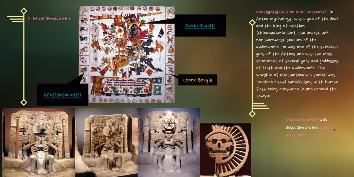
Historical Research: Aztec Deities
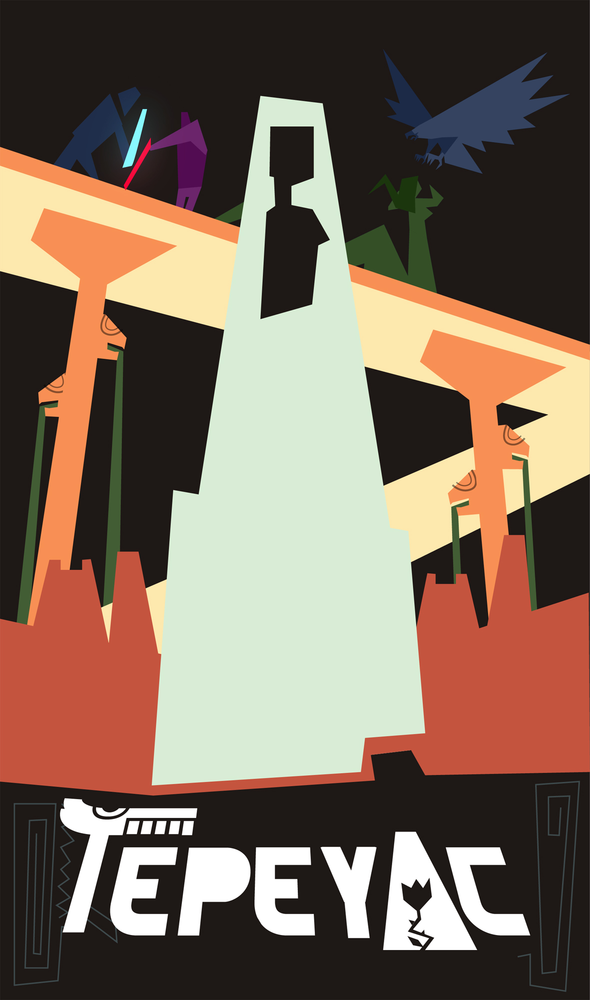
Art by Marco Bambina; Art Direction by Gaetano Leonardi.
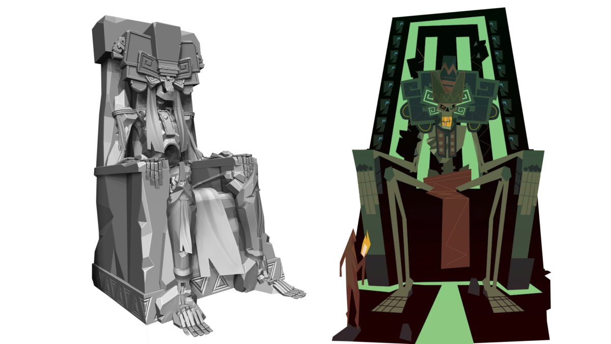
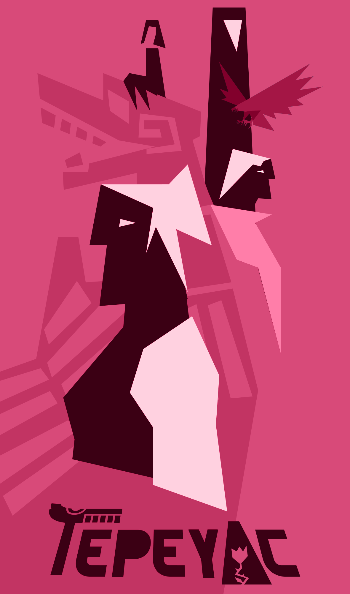
Mictlantecuhtli interpretation by Gaetano Leonardi.
Art by Marco Bambina; Art Direction by Gaetano Leonardi.
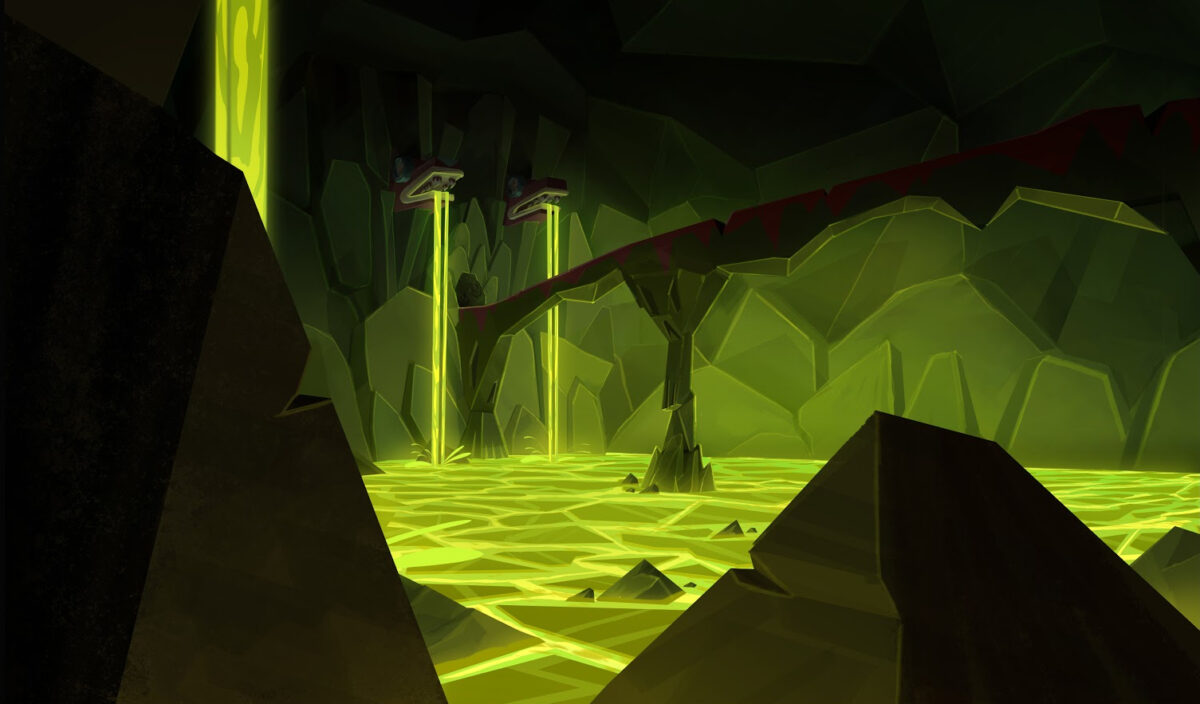
Color Keys – Art by Marco Bambina.
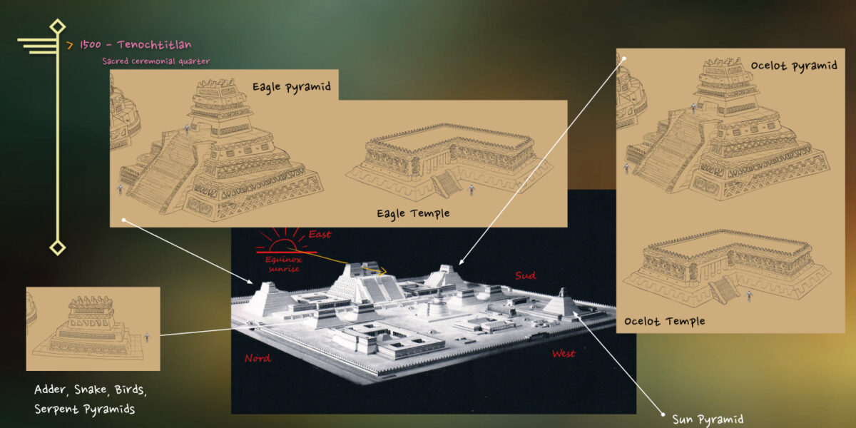
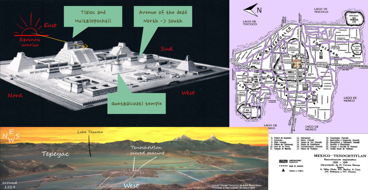
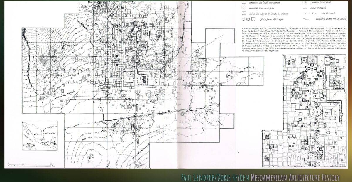
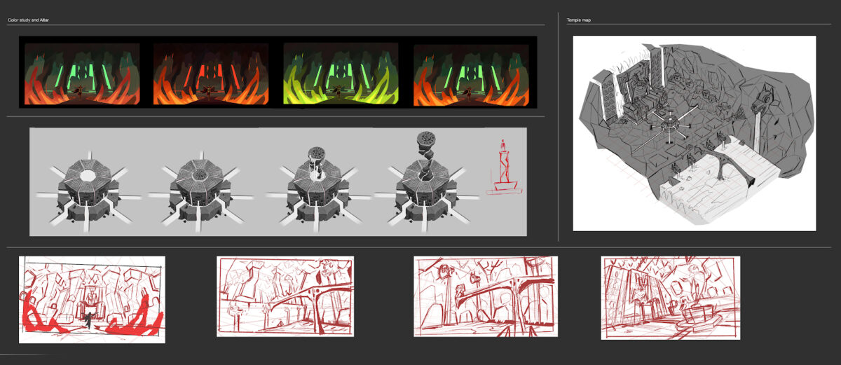
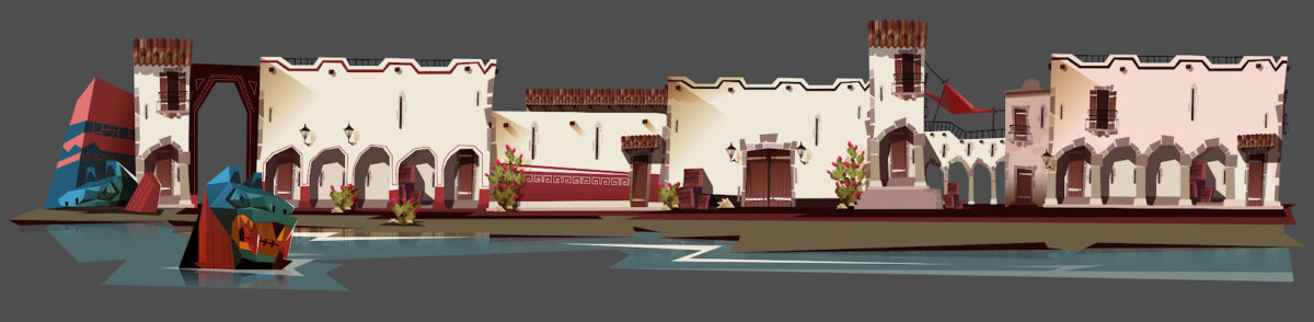
Architectural Historical Research
Architecture Example – Art by Gaetano Leonardi.
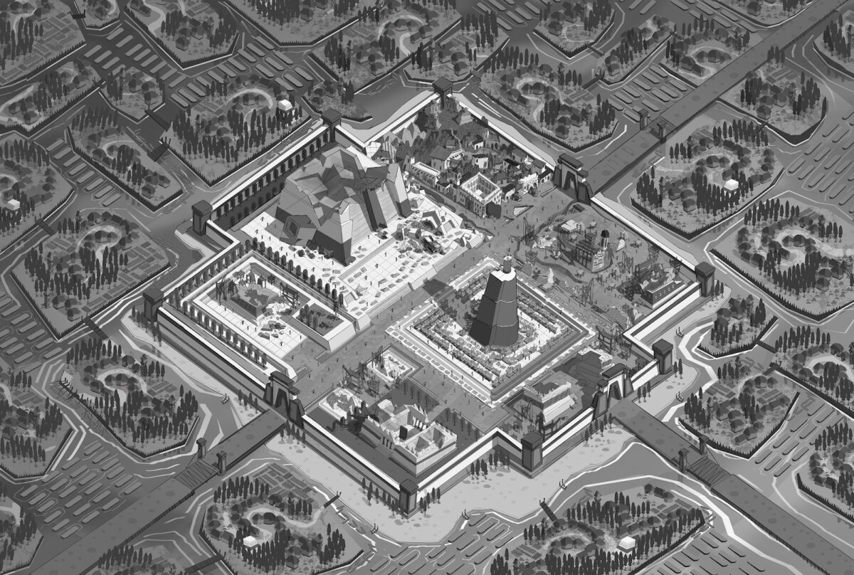
Tenochititlan Concept – Art by Marco Bambina; Art Direction by Gaetano Leonardi.
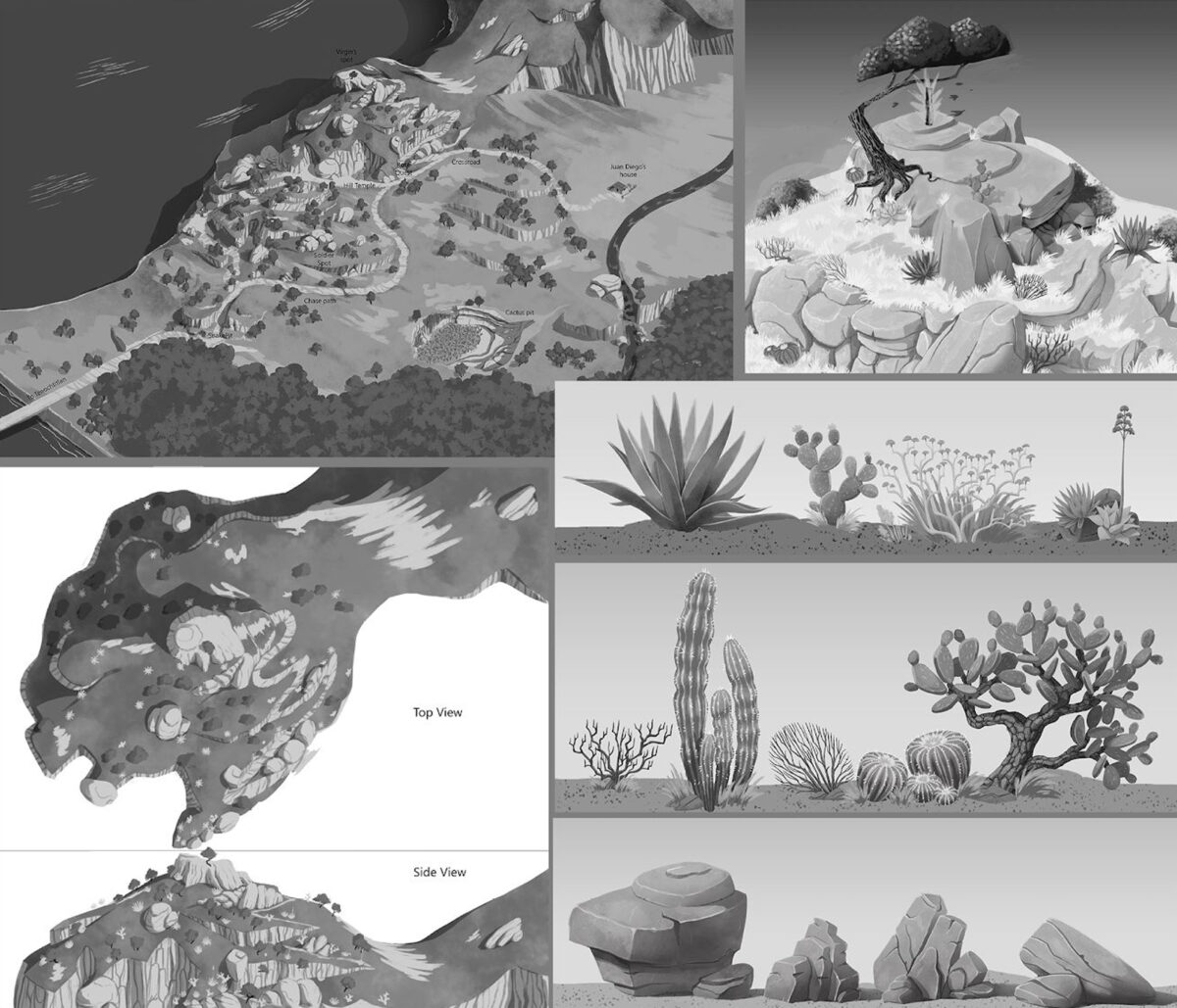
Vegetation and Environmental Research – Art by Daniel Ferrara; Art Direction by Gaetano Leonardi.

Characters
Character design Supervising
I also developed several early character sketches during the pre-production phase.
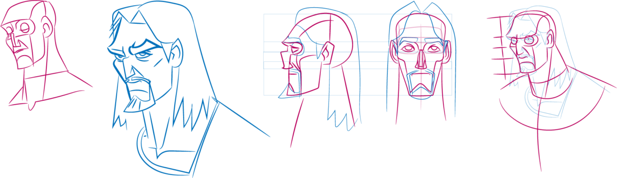
These materials were primarily created to brief the artists for the next stage of development.
Character Design by Nunzio Cafagna;
Art direction by Gaetano Leonardi.
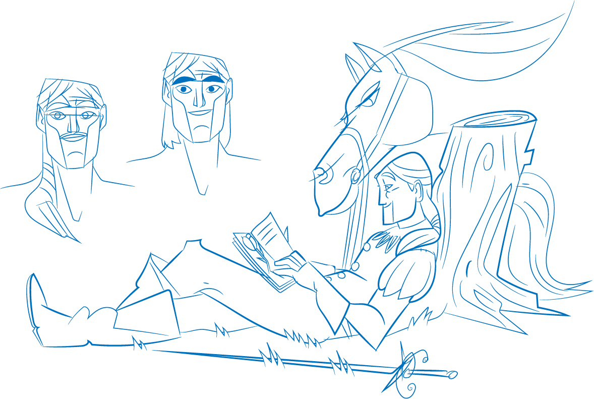
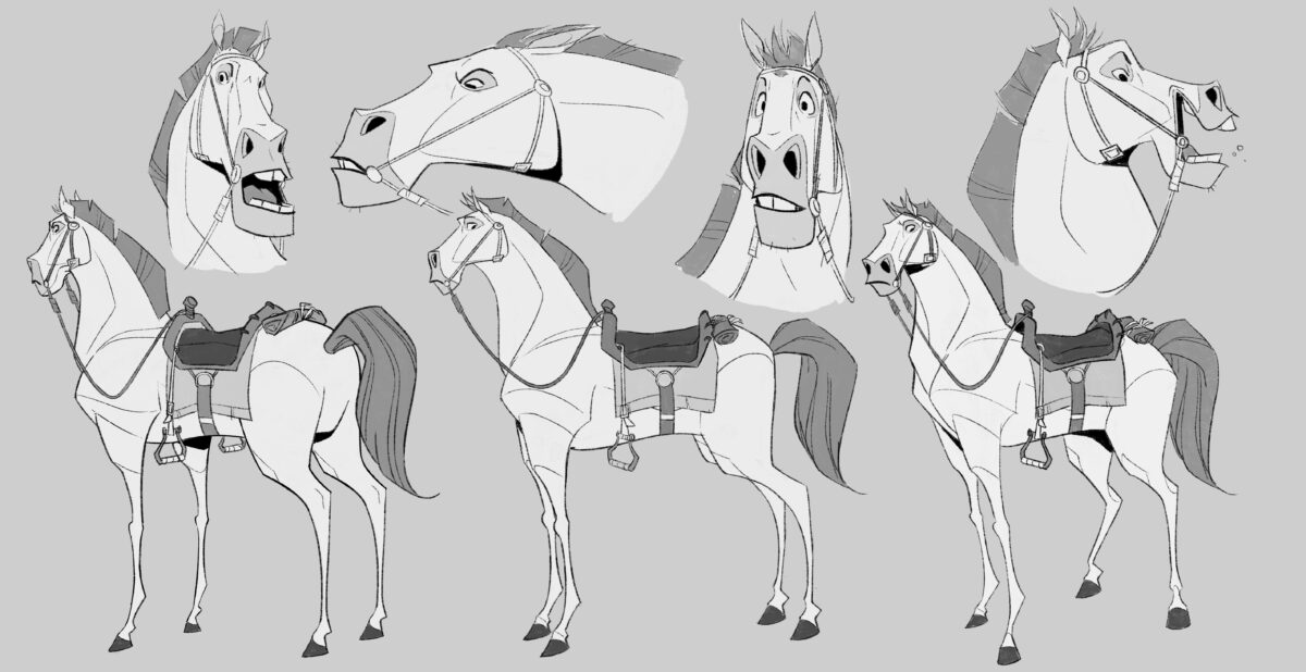
Sketches for Artist Briefing.
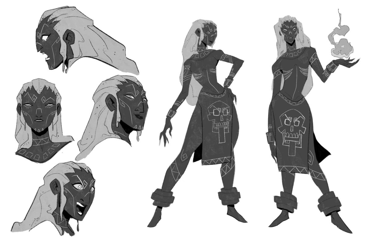
Character Design by Nunzio Cafagna; Art direction by Gaetano Leonardi.
Sculpting supervising
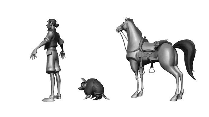
3D Character design
I supervised the sculpting process, working directly on top of the artists’ models when necessary to ensure visual consistency and maintain the integrity of the characters.
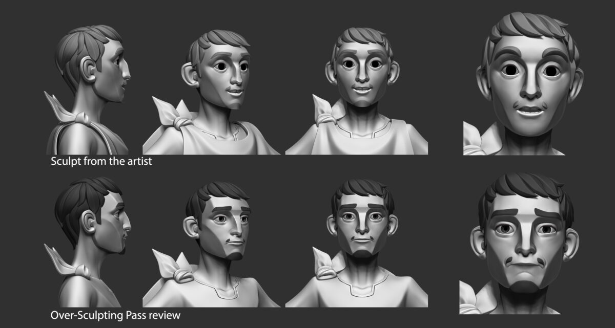
Over-Sculpting Pass by Gaetano Leonardi.
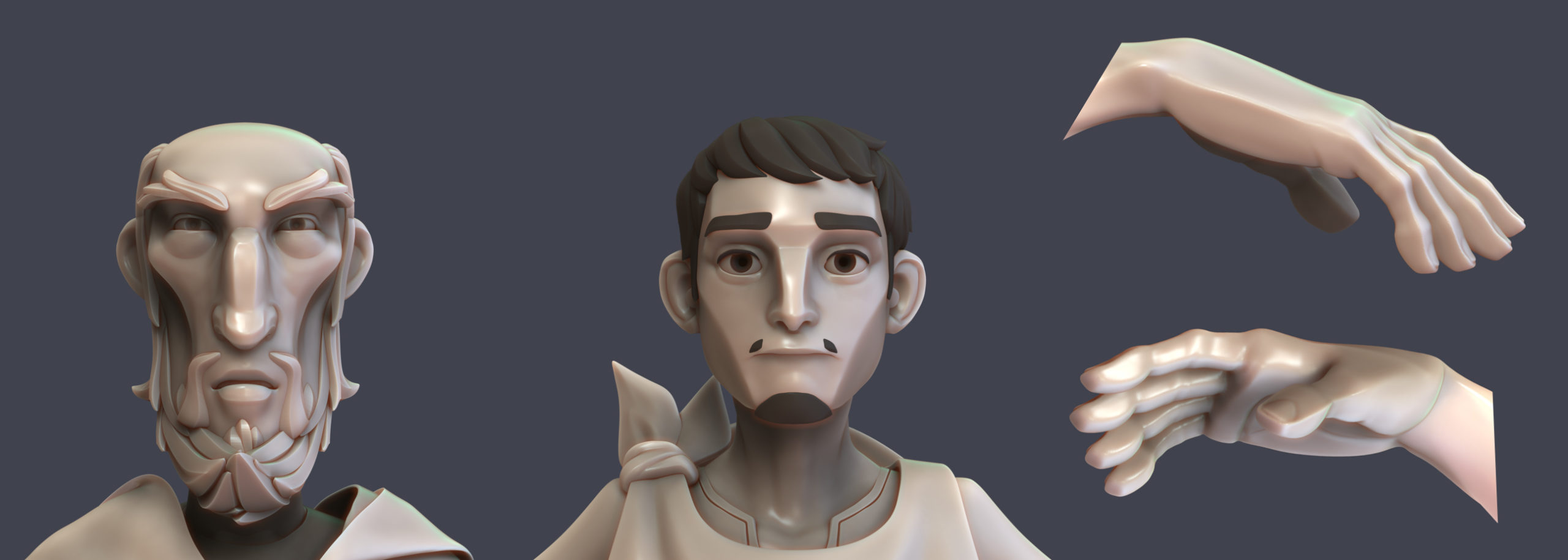
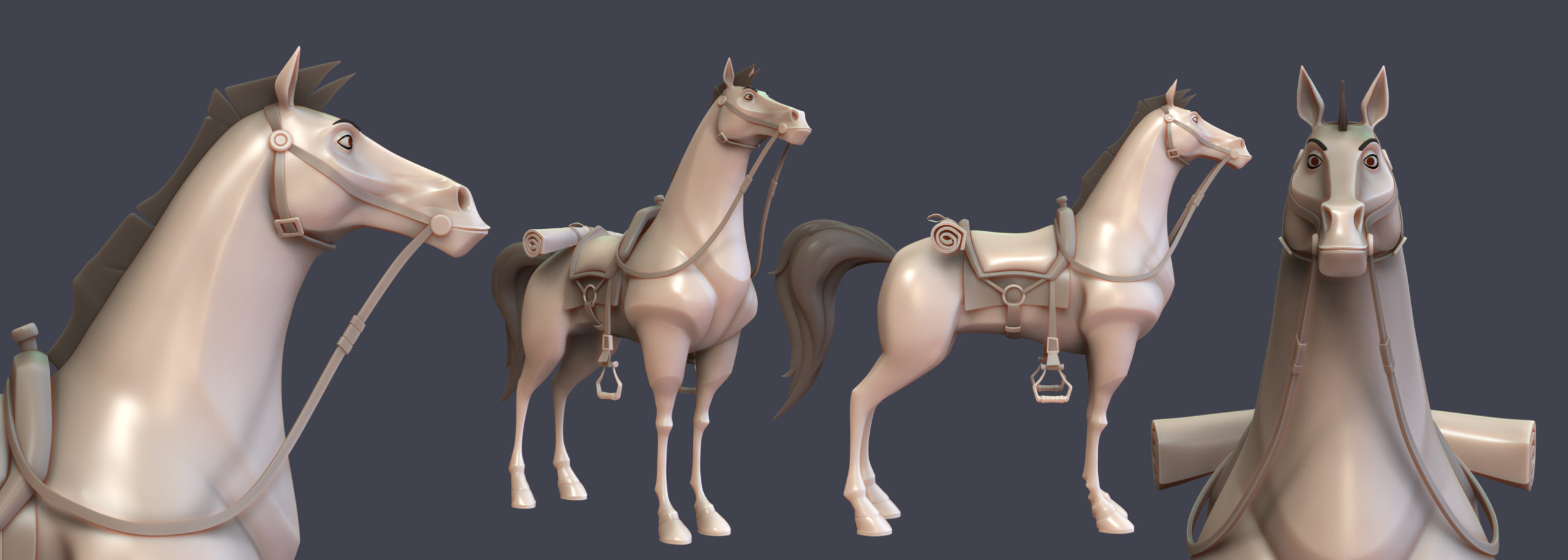
Over-Sculpting Pass by Gaetano Leonardi.