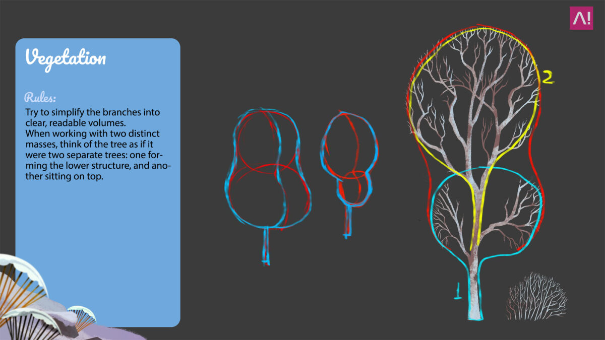
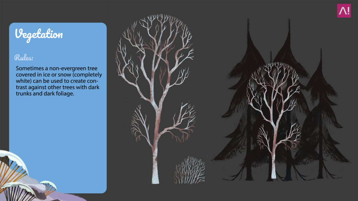
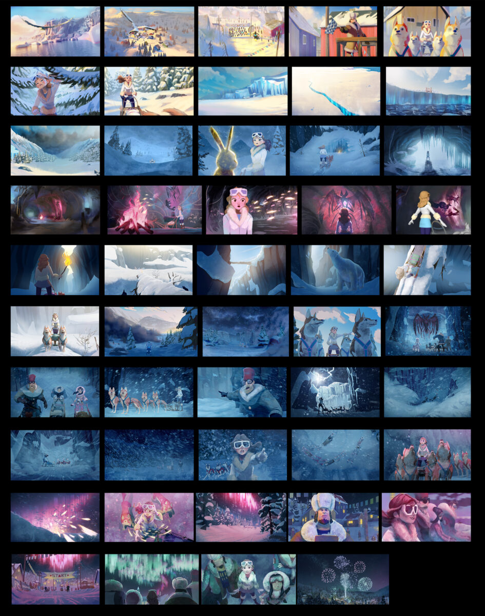
Tree Example – Explaining the Rule to the Artist
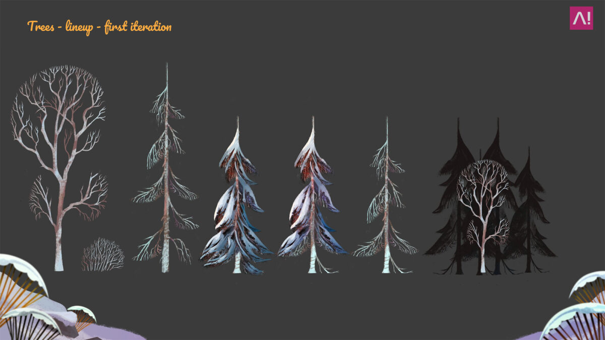
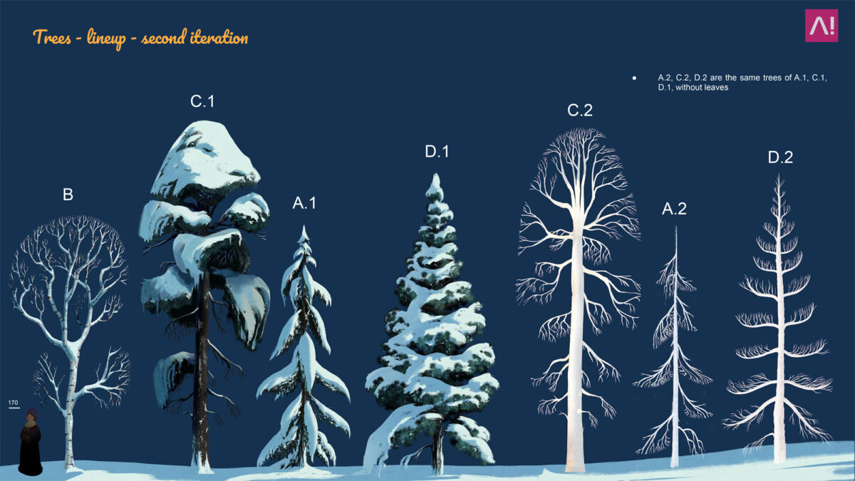
First iteration by Gaetano Leonardi – Second Iteration by Daniela Farrera
Visual Communication
Define the Right Communication Goal
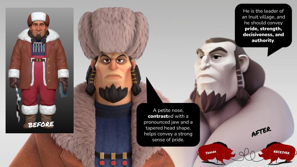
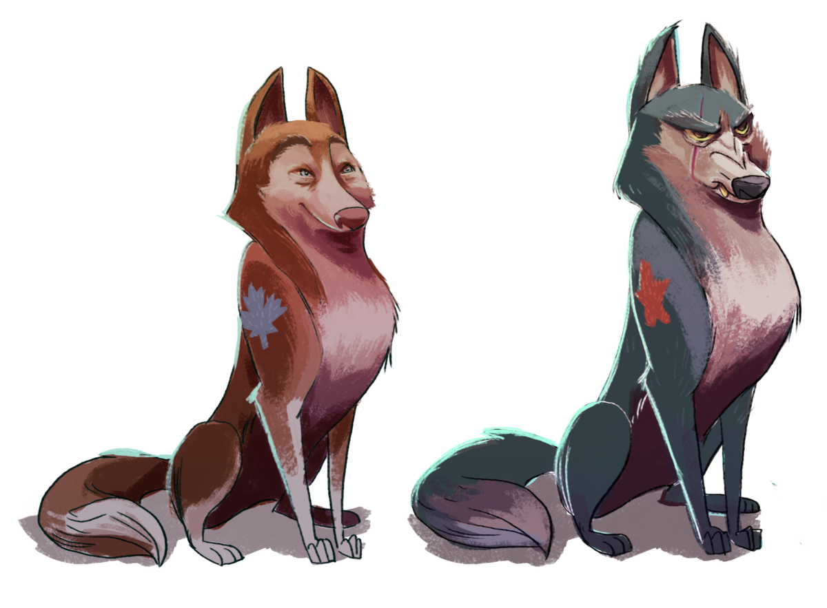
When designing a character, the most important element is the message you want to convey. Defining clear keywords or a strong premise helps you stay focused, avoid unnecessary details, and ensure the character aligns with the story you’re building.
Example:
Before I joined the project, the character had a large nose (suggesting goofiness), sloped shoulders (implying weakness), and a posture that didn’t convey authority. It wasn’t inherently wrong, it was simply wrong for that specific character.
He needed to embody strength, pride, and leadership. Someone deeply rooted in his culture.
By working with contrasts: a proud gaze emerging from a smaller nose, balanced by a strong jawline, the character immediately gained presence and authority.
The communication goal.
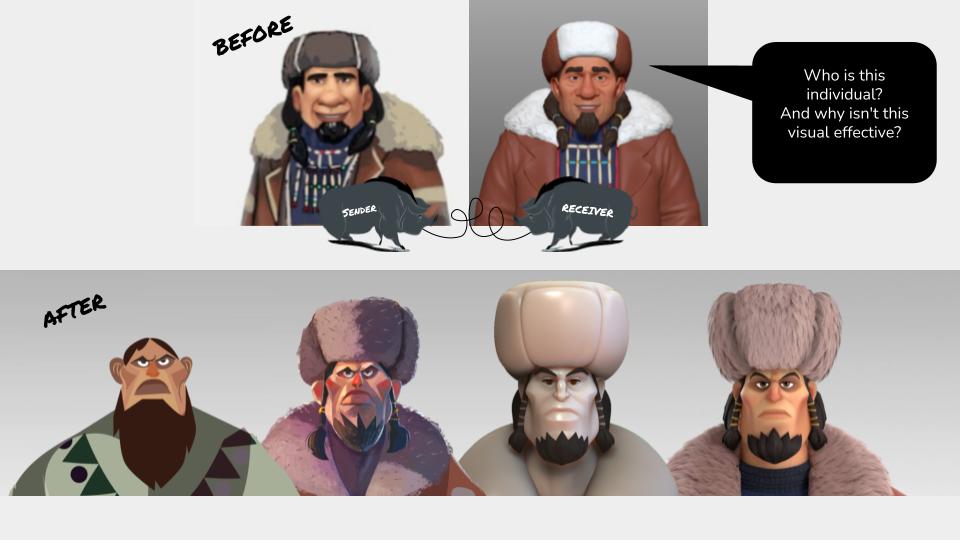
What do you want to communicate?
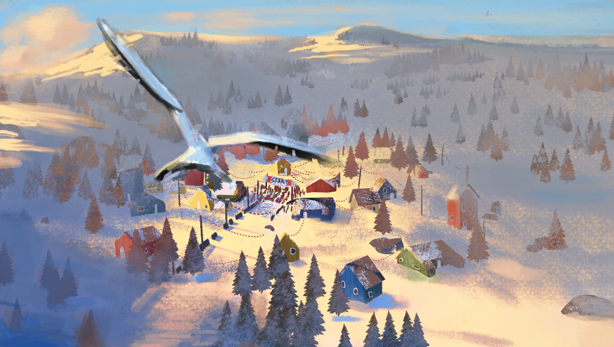
Color Keys – Art by Daniel Farrera; Art direction by Gaetano Leonardi.
Lighting Supervising
Helping the team
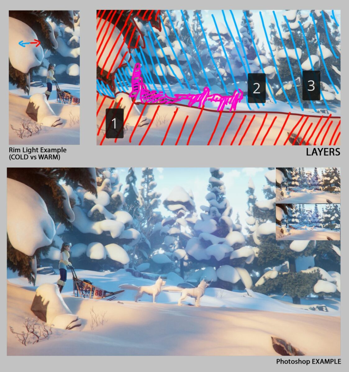
I usually divide the image into three layers: Foreground; Characters; Background. Then play with: warm vs cold colors; exposure vs shadow. If the foreground is warm, push the background colder and viceversa. You’re basically guiding the viewer’s eye without them noticing.
One more important habit: Before sending feedback to the team, I always do a quick paint-over in Photoshop. A concrete visual suggestion works infinitely better than an abstract explanation. People understand in seconds what words would take minutes to describe.
What do you want to communicate?
Color Key
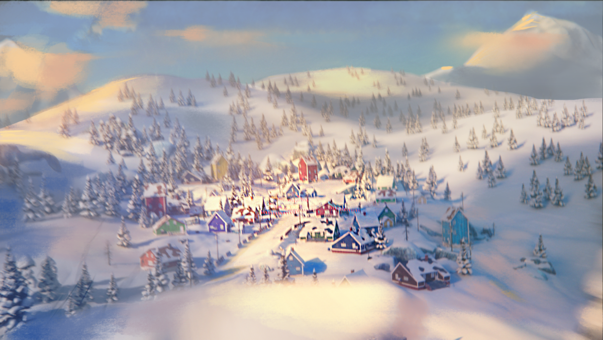
Final Shot
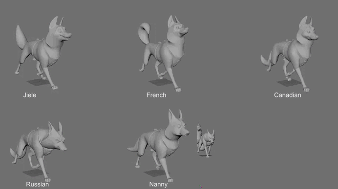
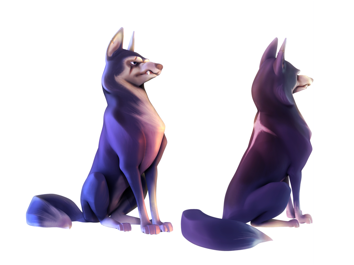
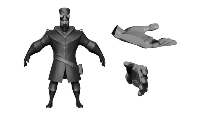
Sculpting supervising
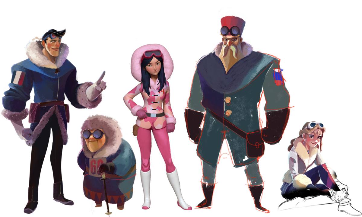
Character design & 3D Character design
I also developed several early character sketches during the pre-production phase. These materials were primarily created to brief the artists for the next stage of development.
In addition, I supervised the sculpting process, working directly on top of the artists’ models when necessary to ensure visual consistency and maintain the integrity of the characters.